In this lesson, we will build a modal component to let the user post new chirps.
Creating the modal
Modals can be a little tricky since they're supposed to always be on top of the rest of the elements. Again though, let's not reinvent the wheel, there's a great addon called **ember-modal-dialog **that makes this easy to implement!
ember install ember-modal-dialogAs always with addons, restart the Ember server. Then add these two lines to your app.scss-file, right after you import the layout:
// app/styles/app.scss

@import "layout";

// Add these 2 lines:
@import "ember-modal-dialog/ember-modal-structure";
@import "ember-modal-dialog/ember-modal-appearance";
Now let's see if the modal works by adding some new Handlebars-code in our application template (right after the liquid-outlet-tag):
{{! app/application/template.hbs }}
{{!-- ... --}}
</header>
{{liquid-outlet}}
{{#modal-dialog translucentOverlay=true}}
<p>Trying out the modal</p>
{{/modal-dialog}}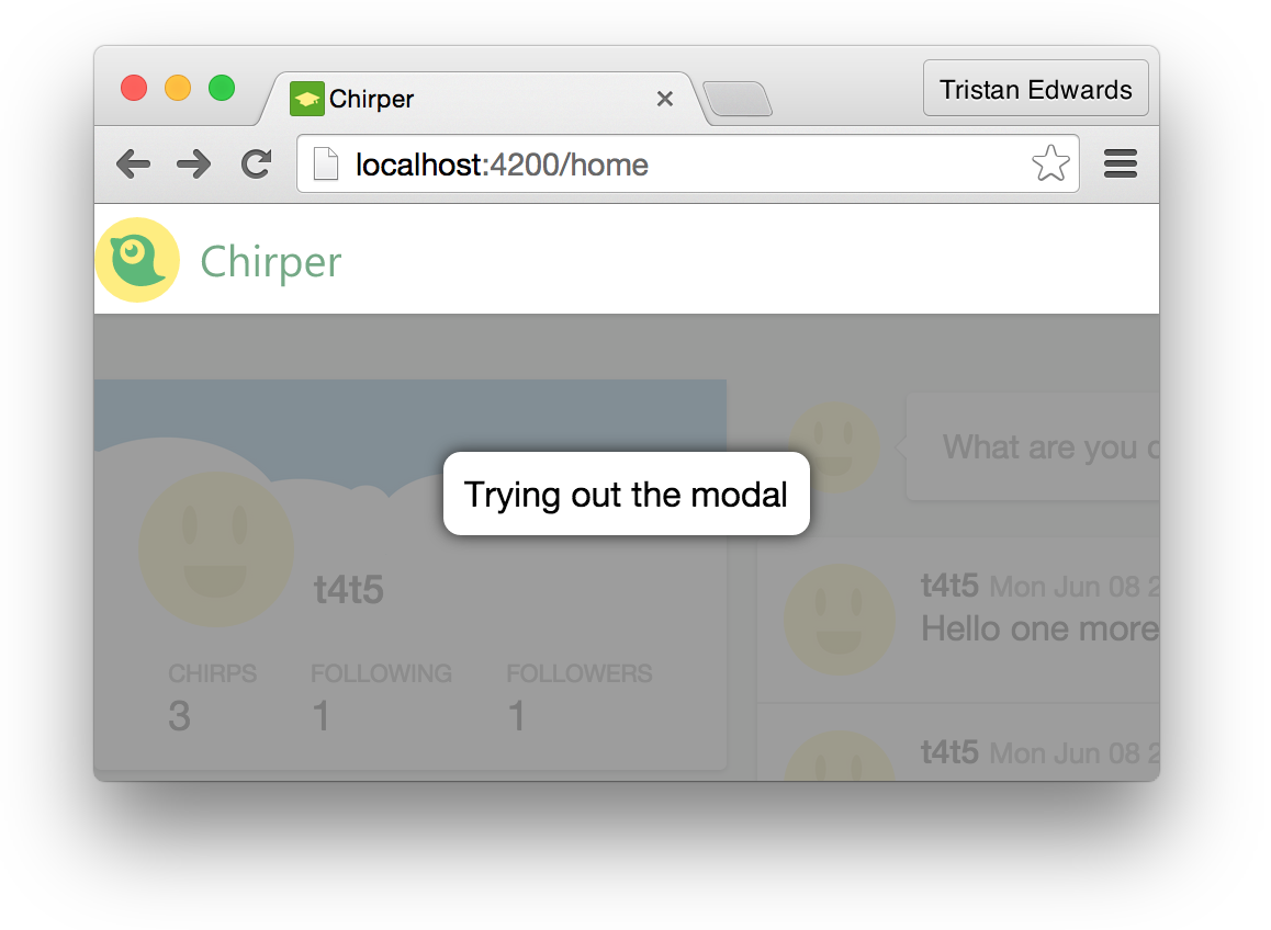 It works! Even though it's not super pretty :-)
Before we go on, let's fix the modal styling. We want to make sure that we have an overlay and box that fit with the rest of the app UI.
Restyling and adding functionality
Open up the file app/styles/ui.scss and add these lines at the bottom:
// app/styles/ui.scss
// Styling the modal
.ember-modal-dialog {
max-width: none;
padding: 15px;
background-color: $bg-color;
box-shadow: 0px 2px 4px 0px rgba(black, 0.19);
border-radius: 4px;
border: none;
overflow: hidden;
z-index: 1000;
}
.ember-modal-overlay.translucent {
background-color: rgba(#4C574A, 0.6);
z-index: 999;
}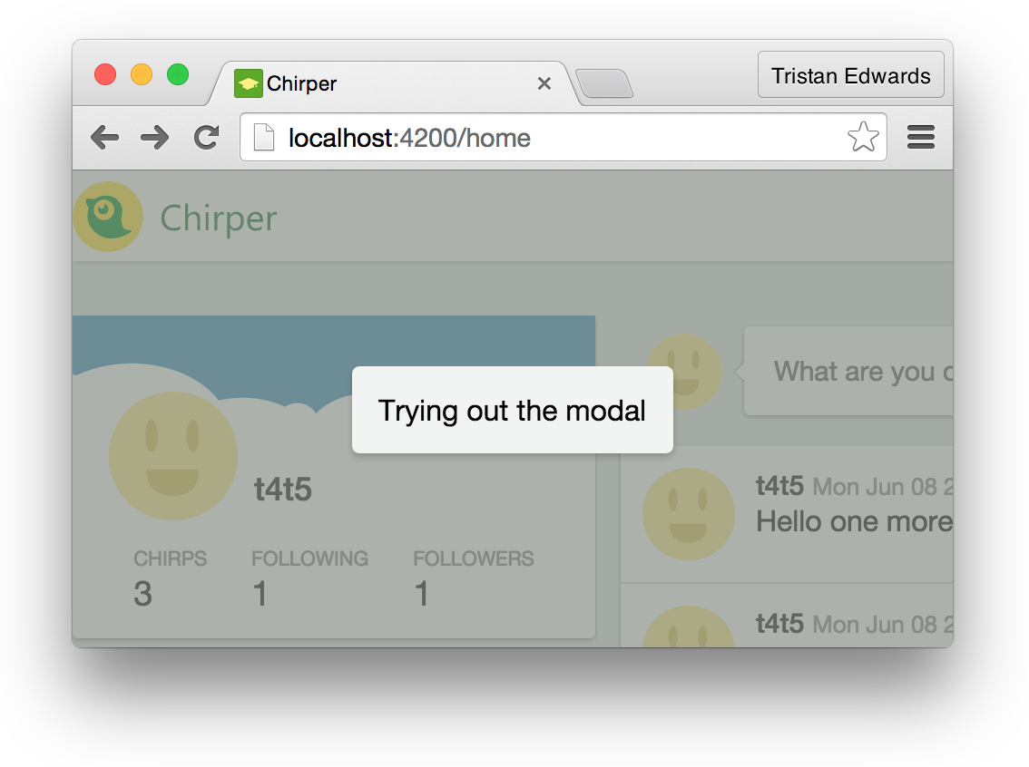 That's a little cleaner!
Alright, now it's time to fix the functionality. We want the modal to be hidden by default, and appear when we click on the header's green "Chirp"-button.
We'll start by changing the markup a bit so that the modal only appears if the variable showingComposeModal is true. We'll also bind a close-action to the modal (this action is called when you click outside the modal on the translucent overlay):
{{! app/application/template.hbs }}

{{#if showingComposeModal}}
  {{#modal-dialog translucentOverlay=true close=(action 'toggleComposeModal')}}
    <p>Trying out the modal</p>
  {{/modal-dialog}}
{{/if}}
showingComposeModal (in the if-statement) is a simple boolean. It is false by default and changes whenever toggleComposeModal is called.
// app/application/controller.js

export default Ember.Controller.extend({
  showingComposeModal: false,

  actions: {
    toggleComposeModal: function() {
      // Toggle boolean value
      this.set('showingComposeModal', !this.get('showingComposeModal'));
    }
  }
});
Finally we bind an action to the existing Chirp-button:
{{! app/application/template.hbs }}

<button class="chirp" {{action 'toggleComposeModal'}}>Chirp</button>
You should now be able to open the modal by clicking on the green Chirp-button in the header, and close it by clicking outside of the modal! Sweet!
Bubbling up actions
So we can now open the modal by clicking the button in the header. However, we also want to be able to open it from the "What are you doing"-speech bubble on our home page.
 Right now if we click this, we just get a SweetAlert.
Let's fix the action in our component and remove the SweetAlert. We'll call the action "compose" instead of the old "showAlert".
{{! app/components/status-update/template.hbs }}

<img class="avatar" src="/images/avatar.jpg" />
<button class="card bubble" {{action 'compose'}}>What are you doing?</button>
Now we want the "compose"-action to "bubble up" until it reaches the controller that contains the toggleComposeModal-action. This is how we do it:
// app/components/status-update/component.js

import Ember from 'ember';

export default Ember.Component.extend({
  actions: {
    compose: function() {
      this.attrs.openComposeModal();
    }
  }
});
{{! app/home/template.hbs }}
{{status-update openComposeModal=(action 'openComposeModal')}}The compose action is now bubbling up and triggering the openComposeModal-action in the home controller. From here, we can inject the application controller on the page so that we can call its toggleComposeModal-action from the home controller!
ember g controller home// app/home/controller.js
import Ember from 'ember';
export default Ember.Controller.extend({
application: Ember.inject.controller(), // This lets us access the application controller's actions
actions: {
openComposeModal: function() {
this.get('application').send('toggleComposeModal');
}
}
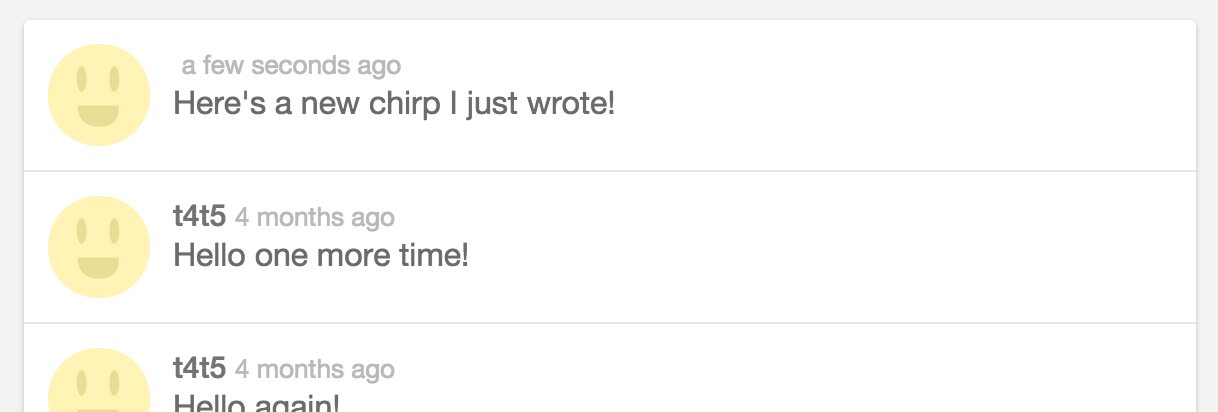
}); The final result!
Turning it into a component
Our modal is now opening and closing the way we want, so let's move on to the next step by replacing the "Trying out the modal"-text with the content that we need! For that, we'll create a new custom component and add some template markup (you probably know the drill by now).
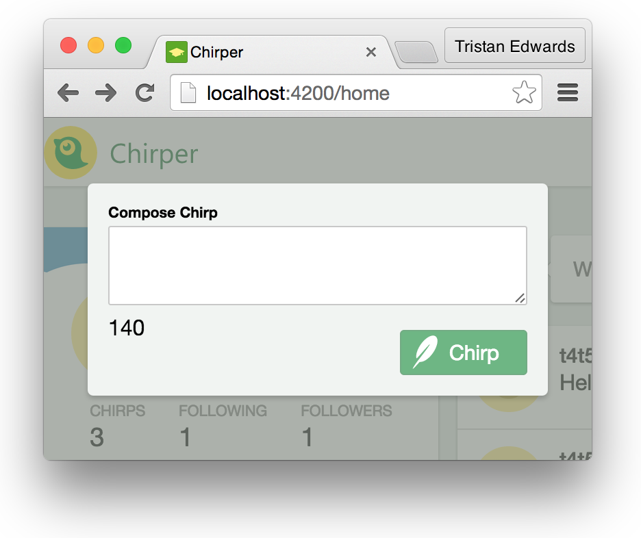
 This is the design we want in our modal!
ember g component compose-modal{{! app/application/template.hbs }}
{{#modal-dialog translucentOverlay=true close=(action 'toggleComposeModal')}}
<!-- We want to be able to close the modal by bubbling a "dismiss"-action from the component too -->
{{compose-modal dismiss=(action 'toggleComposeModal')}}
{{/modal-dialog}}{{! app/components/compose-modal/template.hbs }}
<h6>Compose Chirp</h6>
{{textarea value=chirpText}}
<button class="chirp" {{action "postChirp"}}>Chirp</button>
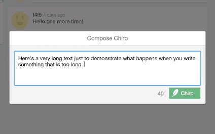
<p class="remaining-chars">140</p>Notice that we're binding a variable called chirpText to the textarea-element in the same way that we did for our login-form.
The p.remaining-chars-element displays the number of characters that you have left for your chirp, although right now it only shows a static number (140).
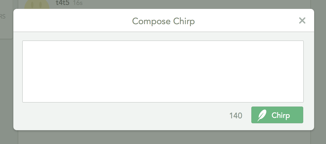
 Almost there! But it needs some styling!
Let's add some CSS to this. Just like we've done with our previous components, we'll create a styles.scss-file inside the component's folder, which will be picked up automatically:
// app/components/compose-modal/styles.scss
& {
width: 548px;
padding-top: 41px;
}
textarea {
resize: none;
min-height: 100px;
font-weight: 400;
}
h6 {
background: white;
border-bottom: 1px solid rgba(0,0,0,0.14);
position: absolute;
left: 0;
right: 0;
top: 0;
color: #818C79;
padding: 11px;
font-size: 17px;
font-weight: 400;
text-align: center;
}
p.remaining-chars {
font-size: 16px;
color: #859389;
line-height: 22px;
float: right;
margin-top: 6px;
&.warning {
color: red;
}
}
button {
margin-top: 0;
}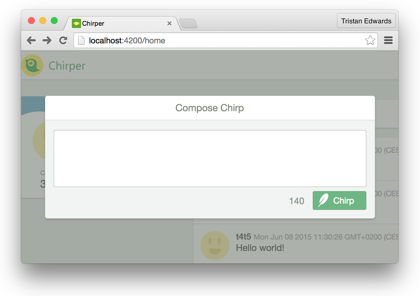 Your modal should now look like this. Awesome!
Adding functionality
The first thing we want to do in terms of functionality is to automatically focus on the textarea when the modal appears, so that the user can start typing directly. This can be done by listening to the didInsertElement event, which will trigger whenever the component is rendered on the page:
// app/components/compose-modal/component.js

import Ember from 'ember';

export default Ember.Component.extend({

  focusOnTextarea: Ember.on('didInsertElement', function() {
    Ember.run.scheduleOnce('afterRender', () => {
      this.$().find('textarea').focus();
    });
  })

});
Okay, a few things to clarify here. First of all, what is Ember.run.scheduleOnce('afterRender')? This is a method that makes sure that all the elements we have in our markup have been loaded into the view before we start manipulating them (because in order to focus on the textarea, we need to know if it's actually there first)!
"But wait", you might say, "wasn't that what didInsertElement was supposed to check? Actually, the didInsertElement event only checks if the component's root element has been rendered, there's no guarantee that all of its children (including the textarea) have finished rendering as well. Therefore, if you try to focus() on the textarea without wrapping it in an afterRender, it might not work.
Secondly, you might not be familiar with the () =>-thing.
This is actually syntax from the new version of JavaScript: EcmaScript 2015 (previously called EcmaScript 6). Even though it's not available in browsers yet, Ember uses a library called Babel, which compiles ES6 syntax to code that works with current versions of JavaScript. This is awesome since it allows us to to use all the new language features without having to worry about backwards-compatibility.
The "fat-arrow", () =>, is just a short way of writing function(). There's one important difference though: the this inside of it keeps the scope of its parent. This comes in handy since we would otherwise have to declare a new variable at the top of the method (e.g. var self = this), just to be able to reference it inside the enclosing function.
Alright, that was a rather lengthy explanation for 5 lines of code. Next up we want to **add a new chirp record to the store **once the user clicks the "Chirp"-button. In our markup we've already specified {{action "postChirp"}}, so let's create that action!
But first, in order for a component to gain access to the store, we need to inject it as a service. Right after the end of the focusOnTextarea-method, add the following line:
// app/components/compose-modal/component.js

  // ...
}),

store: Ember.inject.service(),
Now we can access the store like we've done in our routes with this.store, but this time it will be through this.get('store') (because it's injected as a service). After that line, we can finally specify what the postChirp-action should do:
// app/components/compose-modal/component.js

// ...

actions: {
  postChirp: function() {
    // Retrieve the value of {{textarea}}
    var text = this.get('chirpText');

    // Fetch the user before adding it to the record
    // (Remember that our chirp model uses DS.belongsTo('user'))
    this.get('store').findRecord('user', 1).then((user) => {

      // Set the data that you want
      var chirpData = {
        text: text,
        user: user,
        createdAt: new Date()
      };

      // Create the record
      var newChirp = this.get('store').createRecord('chirp', chirpData);

      // Save the record so that it shows up in the DOM
      return newChirp.save();

    }).then(() => {
      this.attrs.dismiss(); // Bubble up the action
    });
  }
}
We're almost done! However, if you try posting a new chirp now, you will see this error message in the console:
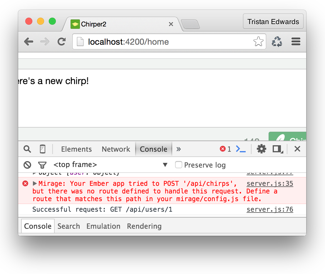
You probably know what to do already! Open up the Mirage config.js-file and add the following line:
// app/mirage/config.js
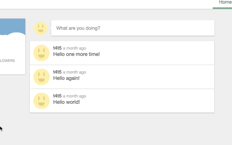
this.post('/chirps');After typing in this code, you should now be able to write a chirp, click the "Chirp"-button, and see it appear almost instantly in the feed!
 Don't worry if your username doesn't appear next to the chirp. This is just a limitation due to the fact that we're using fixtures instead of a real REST API, and it will be fixed soon!
Isn't it liberating not to have to deal with jQuery selectors or manually injecting pieces of markup into your HTML? Most of the time in Ember, the only thing you need to think about is the data in your models, and as long as your markup logic is solid, Ember will take care of the rest by updating all the occurrences of your data throughout the application.
Fixing the details
The last thing we want to fix is the character count. Right now it's static and always displays "140", but we want it to count down as we type, and turn red if the number becomes negative.
We'll start with the countdown. In our markup, we'll replace the static number with a variable called remainingChars. This variable will be a computed property in our component-file, based on the length of chirpText.
{{! app/components/compose-modal/template.hbs }}

<p class="remaining-chars">{{remainingChars}}</p>
// app/components/compose-modal/component.js
// ...
// We need to initialize chirpText so that the computed >
// > property doesn't raise an exception when it's undefined
chirpText: '',
remainingChars: Ember.computed('chirpText', function() {
return 140 - this.get('chirpText').length;
}),
store: Ember.inject.service(),
// ...After this change, you should see the number at the bottom of the modal decrease as you type. Cool!
Now for the last feature, we want the number to turn red if you have no characters left. This will be done by adding the class "warning" to the text.
First, let's create yet another computed property. This one will just return a boolean depending on if the character limit has been reached or not.
// app/components/compose-modal/component.js

noCharsLeft: Ember.computed('remainingChars', function() {
  return (this.get('remainingChars') < 0);
}),
Now that we have that variable, we can simply bind the class in our markup to it like this:
{{! app/components/compose-modal/template.hbs }}

<p class="remaining-chars {{if noCharsLeft 'warning'}}">{{remainingChars}}</p>
Finally, let's just make a slight modification to our postChirp action, so that it prevents the user from posting if they surpass the character limit:
// app/components/compose-modal/component.js

// ...

actions: {
  postChirp: function() {

    if (this.get('noCharsLeft')) {
      swal("Woops!", "You have too many characters in your chirp!", "error");
      return false;
    }
  // ...
Again, the use of HTMLBars and computed properties makes our code much more elegant, readable and maintainable compared to manually replacing the values through DOM selectors.
 That's it! It all works!
By now, you might have noticed that, even though you can post new chirps, as soon as you refresh the page, they are gone! This is because they aren't stored in any database anywhere. Not to worry though, in our next chapter, we'll finally get rid of the Mirage fixtures and build a real Node.js backend with a database!