Components are a way to break up your website into small, reusable parts. If you've worked with React.js or Angular.js before, you're probably already familiar with this concept.
Generally, you will find that components offer a much more practical way to organize the front-end structure of your web app, compared to the traditional MVC-approach. One of its coolest features is that it more or less lets you define your own HTML-tags, which can be much more descriptive than having just another span or div-tag.
Preparing the home page
Let's take a look at the mockup we have for our home page and see how we could "componentize" it:
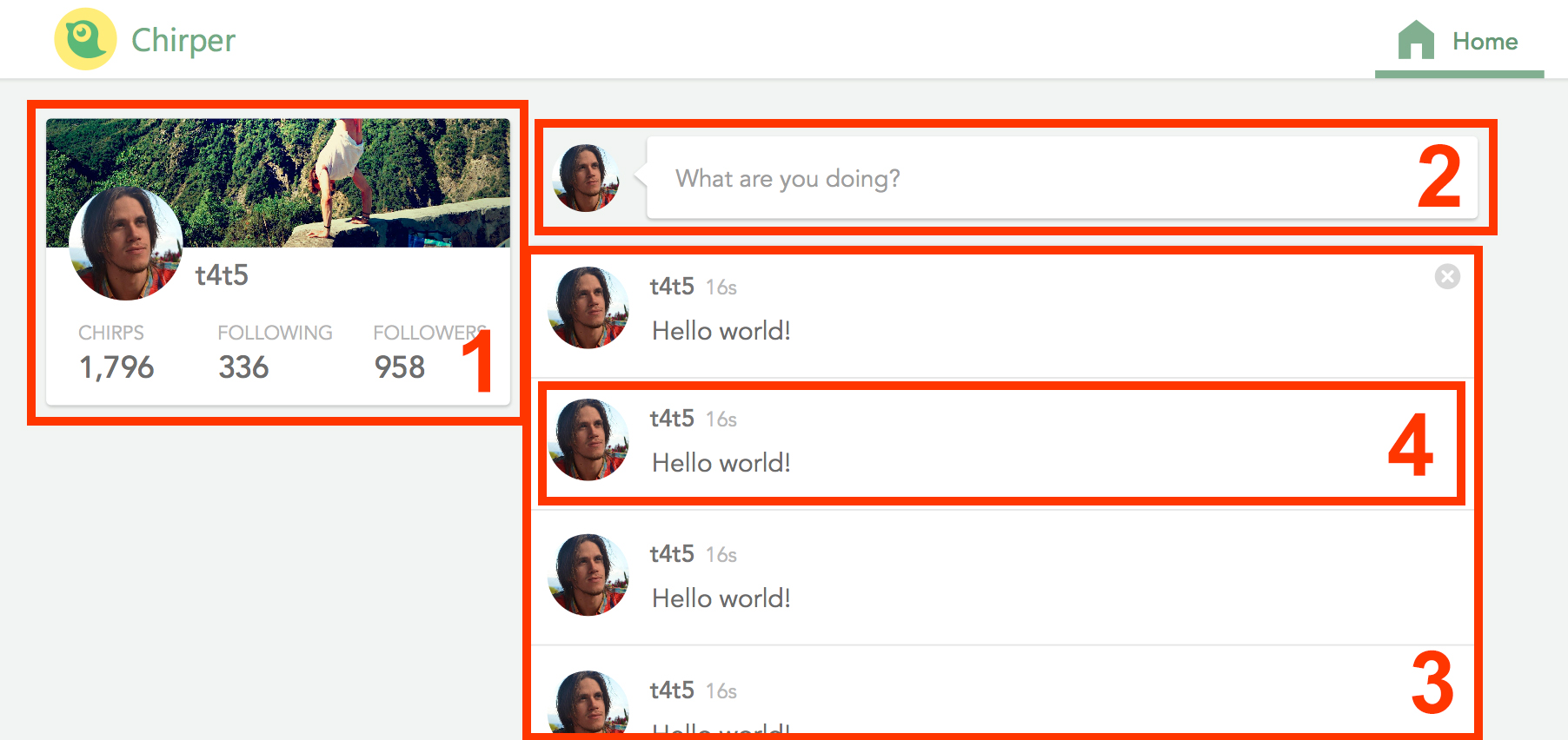 Splitting our page into these 4 components seems to make sense!
Keep in mind that Ember embraces the W3C Web Components specification, which says that web components must have a dash in their name (this is so that they don't collide with existing or future standard HTML-tags). Therefore, the name of our components will be:
-
profile-glance: shows a summary of the user's profile. Clicking on it takes you to the profile page. -
status-update: clicking on it opens up a modal where you can compose a new chirp. -
chirps-list: a list of chirps. -
chirp-message: a single chirp. Notice that this one is inside ofchirps-list(components within components are no problem!)
Our first component
Let's create our first component! Bring up the terminal and type:
ember g component profile-glanceYou'll notice that Ember created two different files for the component: template.hbsand component.js (as well as a test-file). One is for the markup, and the other for the JavaScript logic. Let's add some markup in the Handlebars-file (we're still just using static data for now):
{{! app/components/profile-glance/template.hbs }}

<div class="cover-photo"></div>
<img class="avatar" src="/images/avatar.jpg" />
{{#link-to "user"}}
  t4t5
{{/link-to}}
<ul class="profile-stats">
  <li>
    <h4>Chirps</h4>
    <p>10</p>
  </li>
  <li>
    <h4>Following</h4>
    <p>10</p>
  </li>
  <li>
    <h4>Followers</h4>
    <p>10</p>
  </li>
</ul>
That will do for now. But how do we make the component show up on the home page? It's actually as easy as dropping the custom tag {{profile-glance}} directly into the home-template! We'll also put some layout tags around it so that it shows up exactly where we want it:
app/home/template.hbs
<h1>Home</h1>
<div class="page-container home-page">
<aside class="left">
{{profile-glance}}
</aside>
</div>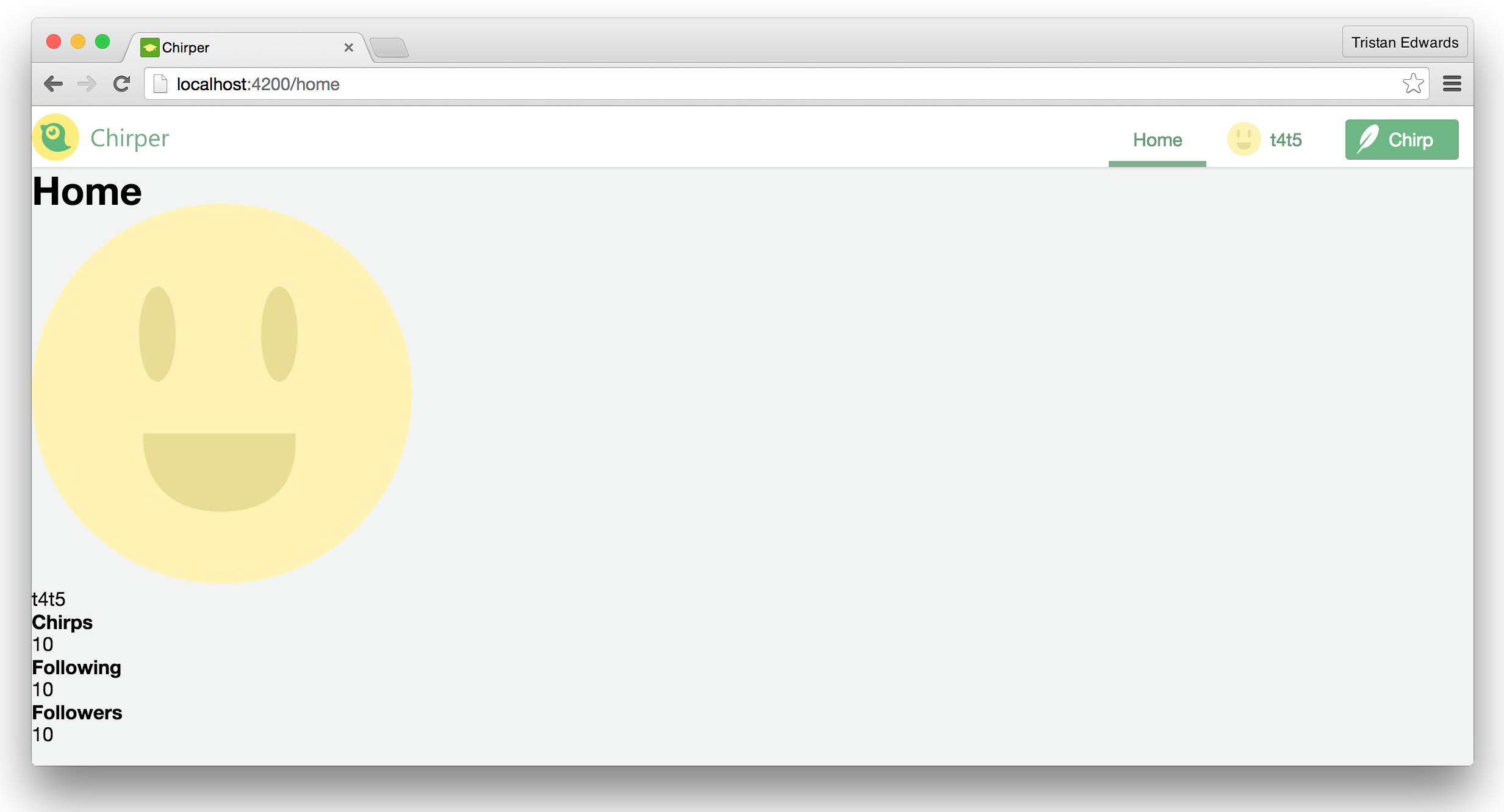 What you should see now.
It works! Although it doesn't really look that great, so let's style it with some CSS.
Scoped CSS for your components
Now, we could go to our styles-folder, create a new SCSS-file there and then import it into app.scss just like we did with the other stylesheets. But since we're using components, I want to show you something even cooler!
Erik Bryn, who is an Ember Core Team member, has written a nifty Ember add-on called ember-component-css that let's you specify CSS directly inside of our component's pod folder. This prevents you from having to repeat your already existing folder structure in the styles-folder, plus, it solves many of the problems that arise with the fact that CSS uses a global namespace. So let's use this library!
ember install ember-component-cssNow, in our profile-glance-folder, we can simply create a file called styles.scss and all the the styling rules we specify will be scoped to that component only!
// app/components/profile-glance/styles.scss

& {
  height: 178px;
  position: relative;
}

.cover-photo {
  height: 80px;
  position: absolute;
  left: 0;
  right: 0;
  top: 0;
  background-color: gray;
}

.avatar {
  width: 71px;
  height: 71px;
  position: relative;
  margin-top: 42px;
  margin-left: 20px;
  border-radius: 50%;
}

a {
  font-size: 18px;
  color: #737373;
  line-height: 25px;
  font-weight: 500;
  position: absolute;
  top: 83px;
  left: 100px;
  &:hover {
    text-decoration: underline;
  }
}

ul.profile-stats {
  margin: 10px auto;
  display: block;
  text-align: center;
  li {
    display: inline-block;
    margin: 0 10px;

    h4 {
      font-size: 11px;
      color: #B5B5B5;
      line-height: 16px;
      text-transform: uppercase;
      font-weight: 400;
    }

    p {
      font-size: 19px;
      color: #6D6D6D;
      text-align: left;
    }
  }
}
In order to make all your component stylesheets part of Ember's build process, you simply need to add this line at the very end of your app/styles/app.scss-file:
@import "pod-styles";After you do this, the app will crash, so restart the Ember server (so that the new add-on can be detected) and refresh your browser to see the results:
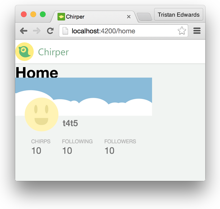 Hello there sexy component!
It's starting to look good! Although there's one final touch. By default, an ember component is actually a div-tag containing all the elements that we specify in the component's .hbs-file. How can we add a card-class to this div-tag so that it gets styled like a card?
For this, we have to go into the component.js-file, and specify the desired classNamesas an array:
// app/components/profile-glance/component.js
import Ember from 'ember';
export default Ember.Component.extend({
classNames: ['card', 'profile-glance']
});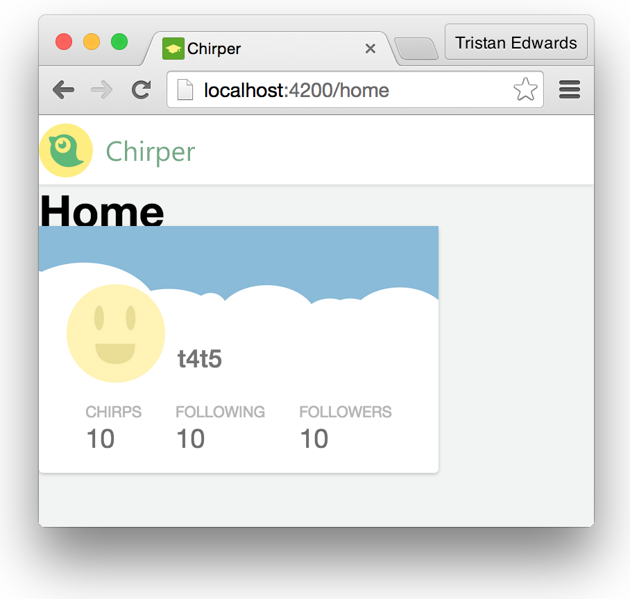 The final result!
That was it! In the rest of this lesson, we'll go through the same process for the rest of the components.
Since you know the drill now, we'll only show the generating code that you need to run in the terminal and then the contents of the files, without any elaborate explanation. Also, remember that we're still just using static data in our files, there's no actual behaviour in our components... yet!
The "status-update"-component
ember g component status-update{{! app/components/status-update/template.hbs }}
<img class="avatar" src="/images/avatar.jpg" />
<button class="card bubble">What are you doing?</button>// app/components/status-update/styles.scss
& {
padding: 10px 0 15px 16px;
}
.avatar {
width: 42px;
height: 42px;
border-radius: 50%;
vertical-align: top;
}
.bubble {
display: inline-block;
padding: 16px;
font-size: 15px;
color: #9E9E9E;
margin-top: -4px;
outline: none !important;
width: calc(100% - 55px);
margin-left: 8px;
text-align: left;
position: relative;
&:hover {
background-color: white;
}
&::after, &::before {
right: 100%;
top: 50%;
border: solid transparent;
content: '';
height: 0;
width: 0;
position: absolute;
pointer-events: none;
}
&::after {
border-right-color: white;
border-width: 5px;
margin-top: -5px;
}
&::before {
border-right-color: rgba(0, 0, 0, 0.11);
border-width: 6px;
margin-top: -6px;
}
}{{! app/home/template.hbs }}
<div class="page-container home-page">
<aside class="left">
{{profile-glance}}
</aside>
<!-- New code -->
<main>
{{status-update}}
</main>
</div>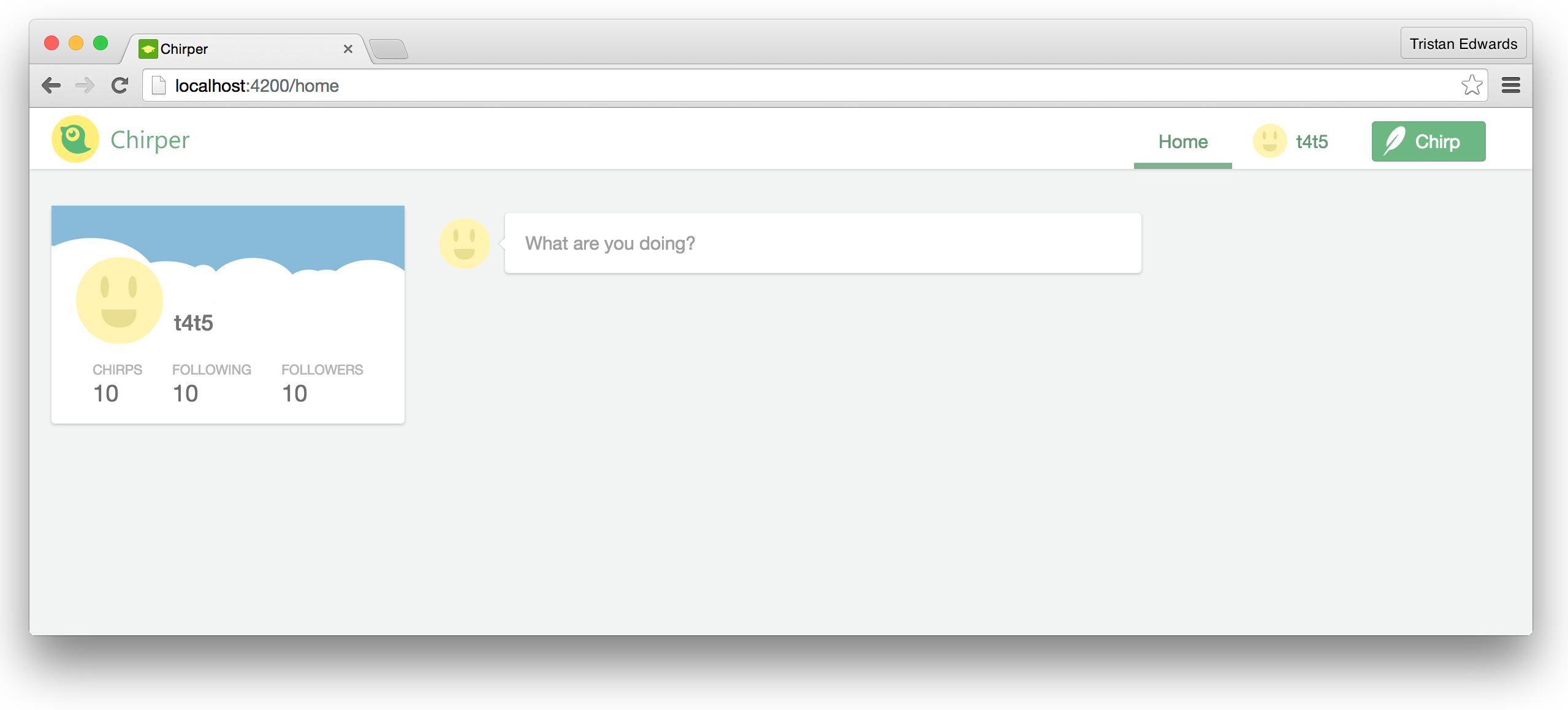 The result
The "chirps-list"-component
ember g component chirps-listWe will fill this template with a list of chirps soon, but for now, let's just show a default "empty" message.
// app/components/chirps-list/template.hbs

<div class="no-chirps">
  <div class="icon"></div>
  <p>There are no chirps to display.</p>
</div>
app/components/chirps-list/component.js
import Ember from 'ember';
export default Ember.Component.extend({
tagName: 'ul',
classNames: ['card']
});// app/components/chirps-list/styles.scss
& {
margin: 2px;
}
.no-chirps {
text-align: center;
padding: 20px;
.icon {
background-image: url("/images/no-chirps.svg");
background-size: contain;
width: 35px;
height: 33px;
display: inline-block;
vertical-align: middle;
margin-right: 10px;
}
p {
font-size: 19px;
color: #B7B9B8;
line-height: 26px;
display: inline-block;
}
}{{! app/home/template.hbs }}
<div class="page-container home-page">
<aside class="left">
{{profile-glance}}
</aside>
<main>
{{status-update}}
{{chirps-list}} <!-- New code -->
</main>
</div>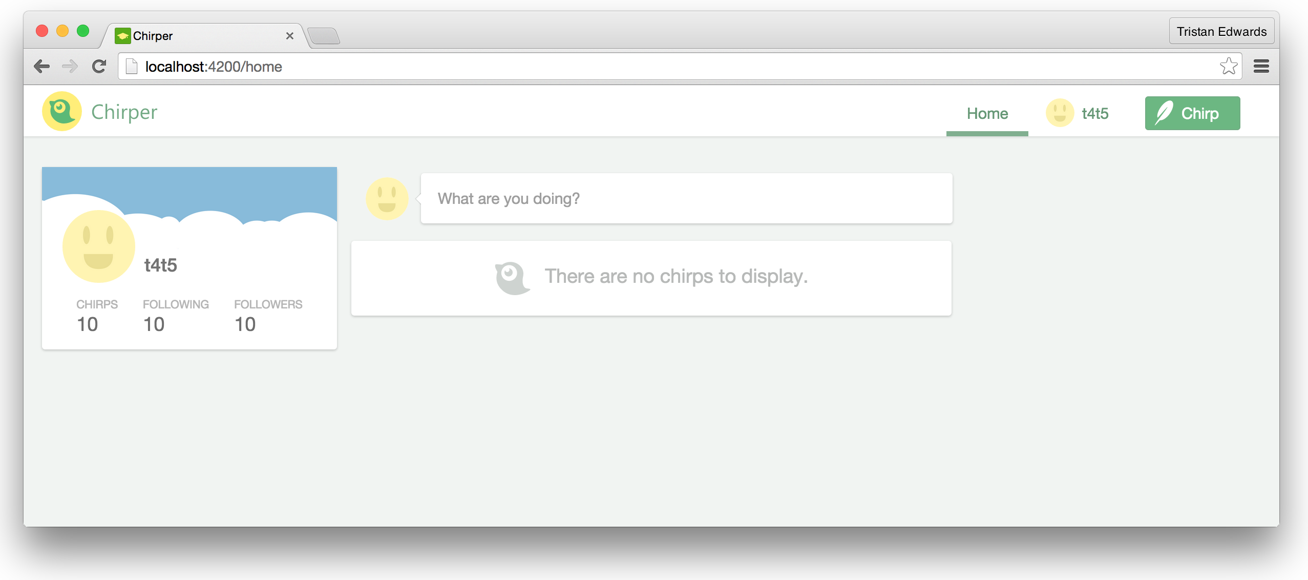 The result.
The "chirp-message"-component
The chirp-message component is a nested component that always lives inside of chirps-list, so here we specify that we want the folder structure to be nested as well:
ember g component chirps-list/chirp-message{{! app/components/chirps-list/chirp-message/template.hbs }}
<img class="avatar" src="/images/avatar.jpg" />
<div class="info">
{{#link-to 'user'}}
t4t5
{{/link-to}}
<time>5 minutes ago</time>
<p>Hello world!</p>
</div>// app/components/chirps-list/chirp-message/component.js
import Ember from 'ember';
export default Ember.Component.extend({
tagName: 'li'
});// app/components/chirps-list/chirp-message/styles.scss
& {
padding: 12px;
border-bottom: 1px solid #e5e5e5;
position: relative;
}
&:last-child {
border-bottom: none;
}
.avatar {
width: 51px;
height: 51px;
vertical-align: top;
margin-right: 7px;
border-radius: 50%;
display: inline-block;
}
.info {
display: inline-block;
max-width: 500px;
}
a {
font-size: 15px;
color: #737373;
font-weight: 500;
display: inline-block;
&:hover {
text-decoration: underline;
}
}
time {
font-size: 13px;
color: #B9B9B9;
line-height: 18px;
display: inline-block;
}
p {
display: block;
font-size: 16px;
color: #6B6B6B;
}
button.close {
background-image: url("/images/close-icon-2.svg");
background-color: transparent;
border: none;
padding: 0;
width: 16px;
height: 16px;
position: absolute;
top: 10px;
right: 10px;
display: none;
}
&:hover button.close {
display: block;
}{{! app/components/chirps-list/template.hbs }}
{{chirps-list/chirp-message}} <!-- New code -->
<div class="no-chirps">
<div class="icon"></div>
<p>There are no chirps to display.</p>
</div>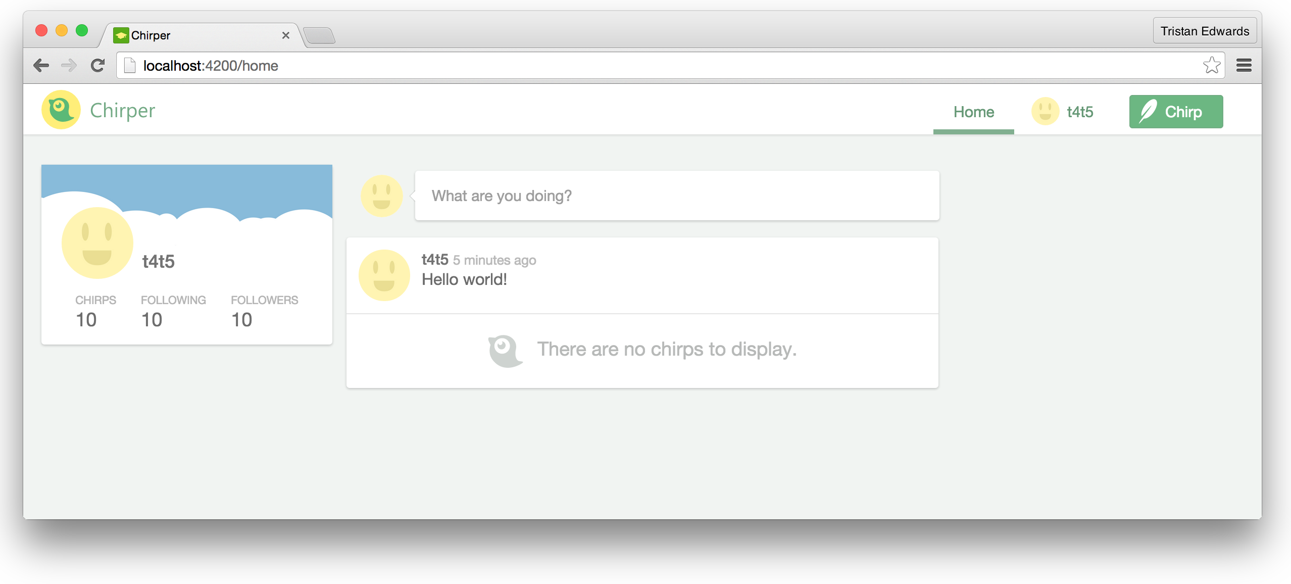 The result!
Good work! We're now done creating the static version of the "home" screen, and you should have a pretty good understanding of how to split up your designs into Ember Components!
In the next chapter, we're going to take the first steps towards making this data dynamic by using Ember Data.