This chapter will be quite centered around JavaScript and React. Even though it's not directly linked to the Solidity programming language, writing DApps isn't all about coding smart contracts, but also building the user interface around it!
Since this isn't really a React tutorial though, this part of the course will be a bit quicker and not explained in as much detail. In other words, don't feel too bad if you mostly just copy-paste the code in this chapter.
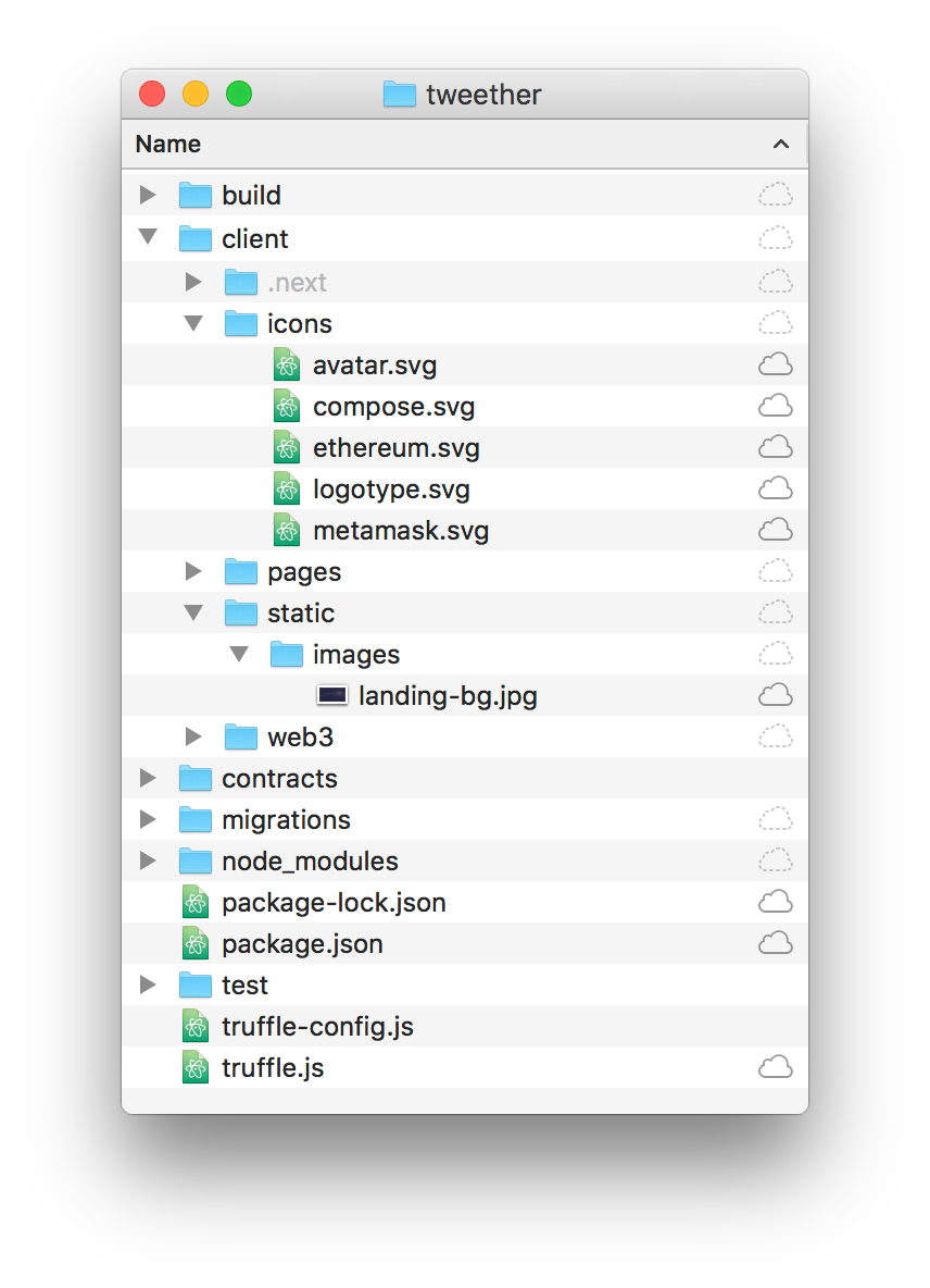
Start by downloading the following zip-file with all the image files for Tweether:
Download
Unzip it, and drag the icons and static folders to your Tweether project's client directory so that the final folder structure looks like this:
Working with components
To get an idea of how we work with components in React, we'll create a Center component. This is something we'll use on almost all our pages, simply to limit how wide the contents of the page should be.
 This is how the <Center> component should work. Just imagine it without the ugly red line of course.
We start by creating a components folder in client, and in in, we add a new file called Layout.js. The component that we define inside the file should be very simple, and uses styled-jsx to generate the CSS:
// client/components/Layout.js

export const Center = ({ children, style }) => (
  <div style={style}>
    {children}

    <style jsx>{`
      div {
        max-width: 1000px;
        margin: 0 auto;
        padding: 20px;
      }
    `}</style>
  </div>
)
Now we head back to pages/index.js, import the Center component, and use it as the root component instead of div in our render function:
// client/pages/index.js
// ...
import { Center } from "../components/Layout"
export default class IndexPage extends React.Component {
// ...
render() {
return (
<Center>
<button onClick={this.logUser}>
Get user with ID 1
</button>
{/* ... */}
<button onClick={this.createTweet}>
Create tweet
</button>
</Center>
)
}
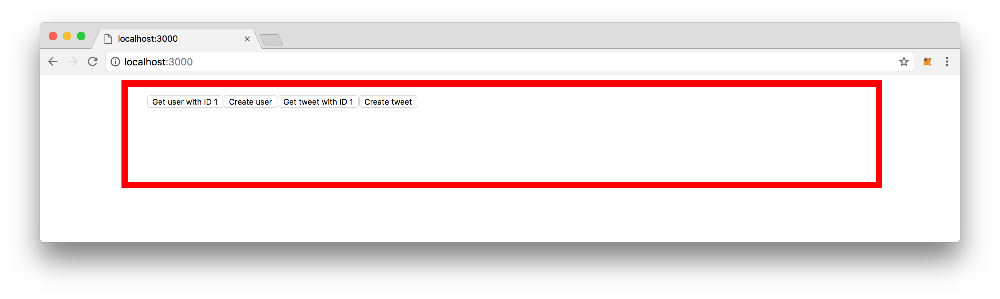
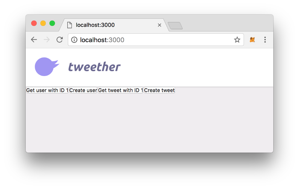
}You'll probably barely notice the difference from before, but if you look closely, you'll see that the content of your index page is now limited to a certain width:
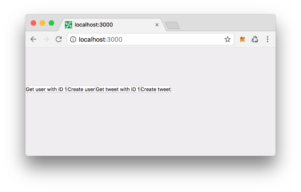
 Your page won't have the ugly red box though.
Creating a page layout
If we think about it, most of our pages look pretty similar -- they use the same font, background color and header for example. In a situation like that, it's usually a good idea to create a wrapper component, which is then used on every page to "set the tone".
In our project, we'll simply call this wrapper component Page, and define it in our existing Layout.js file. We'll import the Google font that we want to use (in this case, Lato) in the Head, then set some basic styles using CSS.
// client/components/Layout.js

import Head from 'next/head'

export const Page = ({ children }) => (
  <div>
    <Head>
      <link href="https://fonts.googleapis.com/css?family=Lato:400,700" rel="stylesheet" />
    </Head>

    <main>
      {children}
    </main>

    <style global jsx>{`
      * {
        margin: 0;
        padding: 0;
      }
      body {
        background-color: #efedf0;
        font-family: 'Lato', 'Helvetica Neue', Helvetica, Arial, sans-serif;
        color: #6B6B8E;
      }
      main {
        padding-top: 80px;
      }
    `}</style>
  </div>
)

// ...
if we import this into our index page, and replace Center with Page, you'll notice the new background colour on your page.
// client/pages/index.js

// ...

// Import "Page" instead of Center:
import { Page } from "../components/Layout"

export default class IndexPage extends React.Component {

  // ...

  render() {
    return (
      <Page>
        <button onClick={this.logUser}>
          Get user with ID 1
        </button>

        {/* ... */}

        <button onClick={this.createTweet}>
          Create tweet
        </button>
      </Page>
    )
  }
}
Adding the header
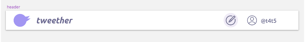
Let's move on to some more advanced components! As you might remember, this is what we want the header in our DApp to look like:
In this component, we'll want to import the SVG logo file that we downloaded earlier. To make this easy, we can use the Babel plugin babel-plugin-inline-react-svg.
npm install babel-plugin-inline-react-svg --save-devTo use it, we need to create a .babelrc file at the root of our project. This will override the default Babel configuration for your Next project, so we need to make sure that we first add @babel/env and next/babel as presets:
// .babelrc

{
  "presets": ["@babel/env", "next/babel"],
  "plugins": [
    "inline-react-svg"
  ]
}
After this, make sure you restart the server using npm run dev so that the changes can take effect. Next, we create the Header.js component file in the components folder.
As you can see below, we can now easily import our logotype.svg as a LogoType component, and place it where we see fit. We've also taken the liberty to add some extra CSS that you'll need in an upcoming chapter, so make sure that you copy-paste all of it!
// client/components/Header.js

import React from 'react'
import Link from "next/link"

import { Center } from "./Layout"
import Logotype from "../icons/logotype.svg"

export default class Header extends React.Component {

  render() {
    return (
      <header>
        <Center>
          <Link href="/">
            <a className="logotype">
              <Logotype />
            </a>
          </Link>
        </Center>

        <style jsx>{`
          header {
            background-color: #FFFFFF;
            box-shadow: 0 1px 3px 0 rgba(0,0,0,0.14);
            position: fixed;
            top: 0;
            left: 0;
            right: 0;
            z-index: 100;
          }
        `}</style>
      </header>
    )
  }
}
Now we import the Header component into the Layout.js file, and add it to our Page component's render function. That way, it will show up on all pages that use Page as a wrapper component!
// client/components/Layout.js

// ...

import Header from "./Header" // <-- Add this!

export const Page = ({ children }) => (
  <div>
    <Head>
      <link href="https://fonts.googleapis.com/css?family=Lato:400,700" rel="stylesheet" />
    </Head>

    <Header /> {/* <-- And this line! */}

    <main>
      {children}
    </main>

    // ...

  </div>
)

// ...
Voila!
Building the landing page
Next up, we're going to build our landing page design!
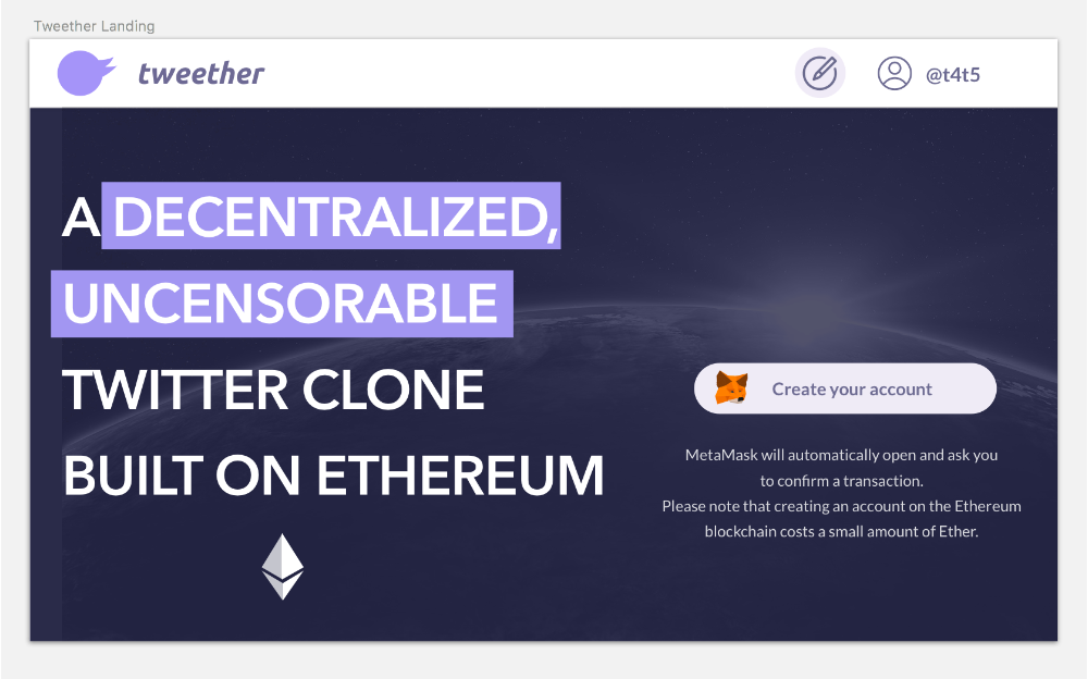 What we want our landing page to look like.
For this, we're going to delete most of the stuff we have in index.js, and replace it. Our buttons were just for demo purposes anyway, and we're going to integrate their functionality in some other places inside the app instead. Let's start by deleting everything inside the IndexPage component, so that we just have a plain page template:
// client/pages/index.js

import React from 'react'
import { Page, Center } from "../components/Layout"

export default class IndexPage extends React.Component {
  render() {
    return (
      <Page>
        {/* Everything in here should be gone now */}
      </Page>
    )
  }
}
Then we fill our page with the following content:
// client/pages/index.js
import React from 'react'
import { Page, Center } from "../components/Layout"
export default class IndexPage extends React.Component {
render() {
return (
<Page>
<Center>
<h2>
A <mark>decentralized</mark>, <mark>uncensorable</mark> Twitter clone built on Ethereum
</h2>
<div className="right-side">
<div className="disclaimer">
<p>
MetaMask will automatically open and ask you to confirm a transaction.
</p>
<p>
Please note that creating an account on the Ethereum blockchain costs a small amount of Ether.
</p>
</div>
</div>
</Center>
<style jsx global>{`
html, body {
min-height: 100%;
}
body {
background-color: #262740;
background-image: url("/static/images/landing-bg.jpg");
background-size: cover;
background-position: center center;
}
`}</style>
<style jsx>{`
h2 {
font-size: 50px;
color: #FFFFFF;
line-height: 78px;
position: relative;
text-transform: uppercase;
max-width: 520px;
display: inline-block;
}
mark {
color: inherit;
background-color: #9F99EC;
padding: 0 7px;
}
.right-side {
float: right;
position: relative;
max-width: 320px;
text-align: center;
margin-top: 120px;
}
.right-side :global(svg) {
position: absolute;
margin-left: -46px;
margin-top: -8px;
}
.disclaimer {
font-size: 14px;
color: rgba(255,255,255,0.8);
line-height: 23px;
font-weight: 400;
margin-top: 23px;
}
`}</style>
</Page>
)
}
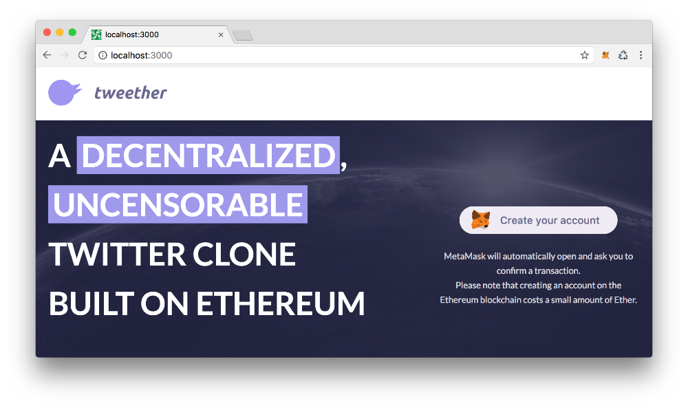
}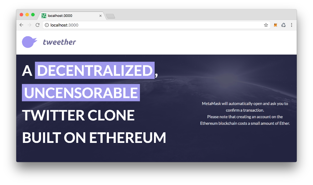 You should already be able to get a glimpse of the final product now!
The only thing missing from the page is a pretty signup button. For that, we'll create a new Button component that we can re-use in other places as well.
// client/components/Button.js

export default ({ children, style, onClick, disabled }) => (
  <button
    style={style}
    disabled={disabled}
    onClick={onClick}
  >
    {children}

    <style jsx>{`
      button {
        background-color: #EEEBF5;
        border: none;
        border-radius: 22px;
        font-size: 16px;
        font-weight: 500;
        color: #6B6B8E;
        padding: 13px 28px;
        text-align: center;
        cursor: pointer;
      }
      button:focus {
        outline: none;
      }
      button[disabled] {
        opacity: 0.5;
        cursor: not-allowed;
      }
    `}</style>
  </button>
)
Then we import the Button, as well as our MetaMask SVG logo, and place them right before our disclaimer text. We also add some padding to the left side of the button so that it encapsulates our MetaMask logo in a nice way.
// client/pages/index.js

import React from 'react'
import { Page, Center } from "../components/Layout"
import Button from "../components/Button" // <--- Add this!
import MetaMaskIcon from "../icons/metamask.svg" // <--- And this!

export default class IndexPage extends React.Component {

  render() {
    return (
      <Page>
        <Center>
          <h2>
            A <span className="marker">decentralized</span>, <span className="marker">uncensorable</span> Twitter clone built on Ethereum
          </h2>

          <div className="right-side">

            {/* Add this: */}
            <Button style={{
              paddingLeft: 64,
            }}>
              <MetaMaskIcon />
              Create your account
            </Button>

            <div className="disclaimer">
              <p>
                MetaMask will automatically open and ask you to confirm a transaction.
              </p>
              <p>
                Please note that creating an account on the Ethereum blockchain costs a small amount of Ether.
              </p>
            </div>
          </div>
        </Center>

        {/* ... */}

      </Page>
    )
  }
}
Great!
Signup modal
When we click the "Create your account" button, we want a modal with a registration form to appear. Since we'll be using modals in other parts of our app (when creating a tweet for example), it makes sense to create a reusable Modal component.
// client/components/Modal.js

export default ({ onClose, children }) => (
  <div>
    <div
      className="overlay"
      onClick={onClose}
    />

    <div className="modal">
      {children}
    </div>

    <style jsx>{`
      .overlay {
        background-color: rgba(65,65,85,0.58);
        position: fixed;
        top: 0;
        bottom: 0;
        left: 0;
        right: 0;
        z-index: 110;
      }
      .modal {
        position: fixed;
        left: 50%;
        top: 50%;
        transform: translateX(-50%) translateY(-50%);
        width: 538px;
        background-color: white;
        box-shadow: 0 1px 27px 0 rgba(0,0,0,0.19);
        border-radius: 3px;
        padding: 14px;
        z-index: 120;
      }
      .modal :global(h3) {
        text-align: center;
        margin: 10px 0;
      }
    `}</style>
  </div>
)
To try it out, we import the modal into our index page, and add this.toggleRegisterModal as an action to our button. The toggleRegisterModal-method simply toggles the value of the boolean state variable showRegisterModal in order to decide whether the Modal component should be rendered or not.
// client/pages/index.js
// ...
import Modal from "../components/Modal" // <-- Add this line
export default class IndexPage extends React.Component {
// Add the default state:
state = {
showRegisterModal: false,
}
// And this method:
toggleRegisterModal = async () => {
const { showRegisterModal } = this.state
this.setState({
showRegisterModal: !showRegisterModal,
})
}
render() {
const { showRegisterModal } = this.state // Get the state
return (
<Page>
<Center>
{/* ... */}
<div className="right-side">
<Button style={{
paddingLeft: 64,
}} onClick={this.toggleRegisterModal}> {/* add the "onClick"-action */}
<MetaMaskIcon />
Create your account
</Button>
{/* ... */}
</div>
</Center>
{/* Add the Modal component: */}
{showRegisterModal && (
<Modal
onClose={this.toggleRegisterModal}
>
Here's our modal!
</Modal>
)}
{/* ... */}
</Page>
)
}
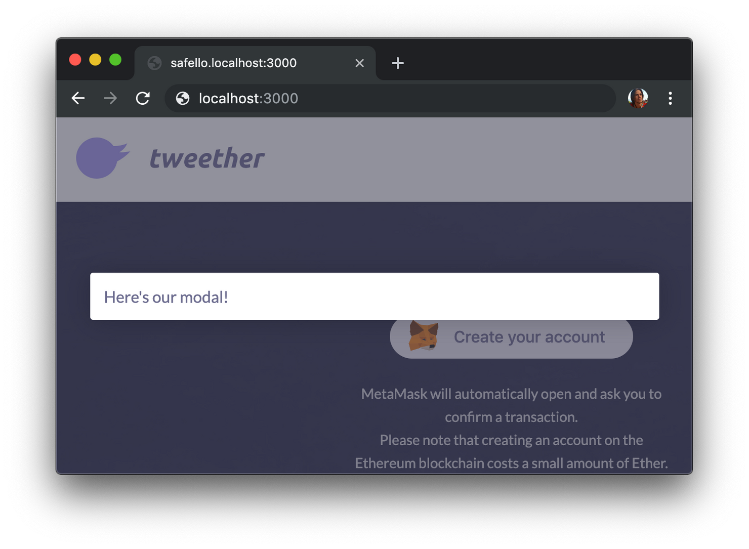
}With this, you should be able to click the button to show the modal, and click outside to dismiss it.
The only thing missing now is the registration form! We'll create a new file for that containing both an Input component and a RegistrationForm component:
// client/components/RegistrationForm.js

import Button from "./Button"

const Input = ({ title, value, onChange }) => (
  <div>
    <label>
      {title}
    </label>

    <input value={value} onChange={onChange} />

    <style jsx>{`
      div {
        border-bottom: 1px solid rgba(0,0,0,0.13);
        margin: 0 -14px;
        padding: 0 14px;
      }
      div:first-of-type {
        border-top: 1px solid rgba(0,0,0,0.13);
      }
      label {
        font-size: 13px;
        color: rgba(81,81,112,0.66);
        text-transform: uppercase;
        display: block;
        margin-top: 8px;
      }
      input {
        width: 100%;
        box-sizing: border-box;
        font-size: 17px;
        padding-top: 8px;
        padding-bottom: 13px;
        border: none;
      }
      input:focus {
        border: none;
        outline: none;
      }
    `}</style>
  </div>
)

export default class RegistrationForm extends React.Component {
  state = {
    firstName: "",
    lastName: "",
    username: "",
    gravatarEmail: "",
    bio: "",
  }

  updateField = (fieldName, e) => {
    const newState = {}
    newState[fieldName] = e.target.value

    this.setState(newState)
  }

  render() {
    const { onClose } = this.props

    return (
      <form onSubmit={this.createUser}>
        <h3>
          Create your account
        </h3>

        <Input
          title="First name"
          onChange={e => this.updateField("firstName", e)}
        />

        <Input
          title="Last name"
          onChange={e => this.updateField("lastName", e)}
        />

        <Input
          title="Desired username"
          onChange={e => this.updateField("username", e)}
        />

        <Input
          title="Gravatar email"
          onChange={e => this.updateField("gravatarEmail", e)}
        />

        <Input
          title="Bio"
          onChange={e => this.updateField("bio", e)}
        />

        <footer>
          <Button onClick={this.createUser}>
            Create
          </Button>
        </footer>

        <style jsx>{`
          h3 {
            padding-bottom: 10px;
          }
          footer {
            text-align: right;
            padding-top: 16px;
          }
        `}</style>
      </form>
    )
  }
}
The actual logic for the this.createUser method will be implemented in the next chapter. For now we focus only on presentation.
As usual, we import the component into the index page, and render it inside the Modal component:
// client/pages/index.js
// ...
import RegistrationForm from "../components/RegistrationForm" // <-- Add this line
export default class IndexPage extends React.Component {
// ...
render() {
// ....
return (
<Page>
{/* ... */}
{showRegisterModal && (
<Modal
onClose={this.toggleRegisterModal}
>
<RegistrationForm /> {/* <-- Add this line */}
</Modal>
)}
{/* ... */}
</Page>
)
}
}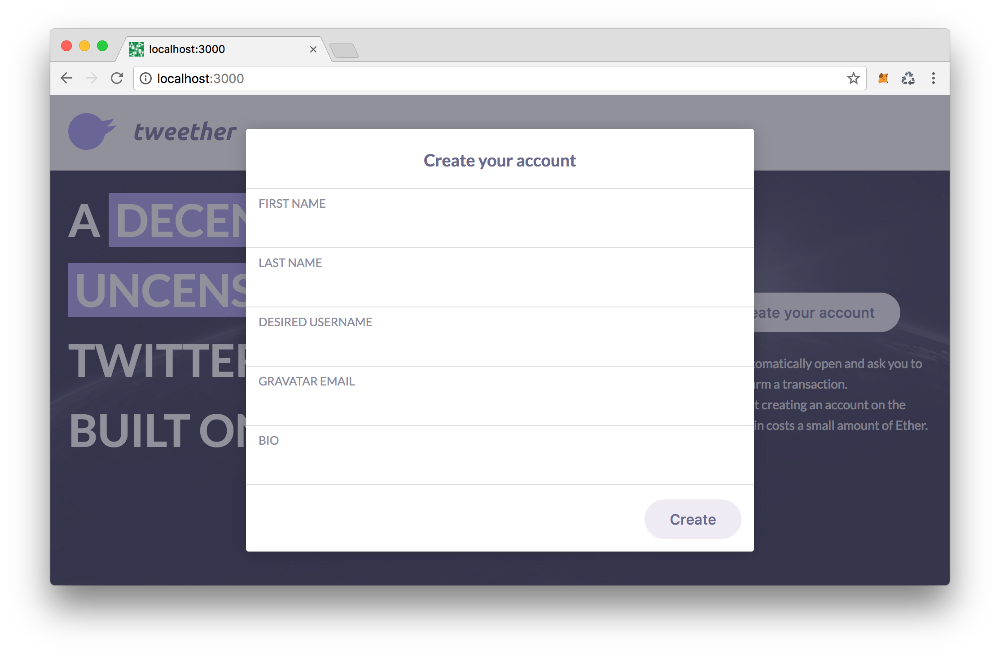 Here's the final result!
Obviously, our form isn't working yet, since there's no communication with the Ethereum blockchain, but now the web app is looking a lot fresher!